So it seems I may have been a
little hasty with my 'Requiem for Grombrindal' article found HERE, for if WD
weekly is anything to go by the spirit of the pale bearded one is very much still
alive and strong. Far from the train wreck I thought it would be, it actually
appears to be a publication of some merit. Of course it is still too expensive
and it does essentially still exist only to show off the new releases but I
actually find it more engaging and page for page more useful than the old
monthly version.
 |
| All very familiar so far.. |
Onward past all the new releases
then, (which incidentally do take up the same percentage of the magazine as the
monthly edition) you then have the guest article, this seems to change each
week. First it was Jervis, with an entertaining if simplistic mini-game to
ascertain who gets the first turn. In issue two it is Phil Kelly’s turn but
unfortunately it just turns into a love letter to his Tyranids not particularly
insightful nor interesting. The next article is a short piece focusing on a new
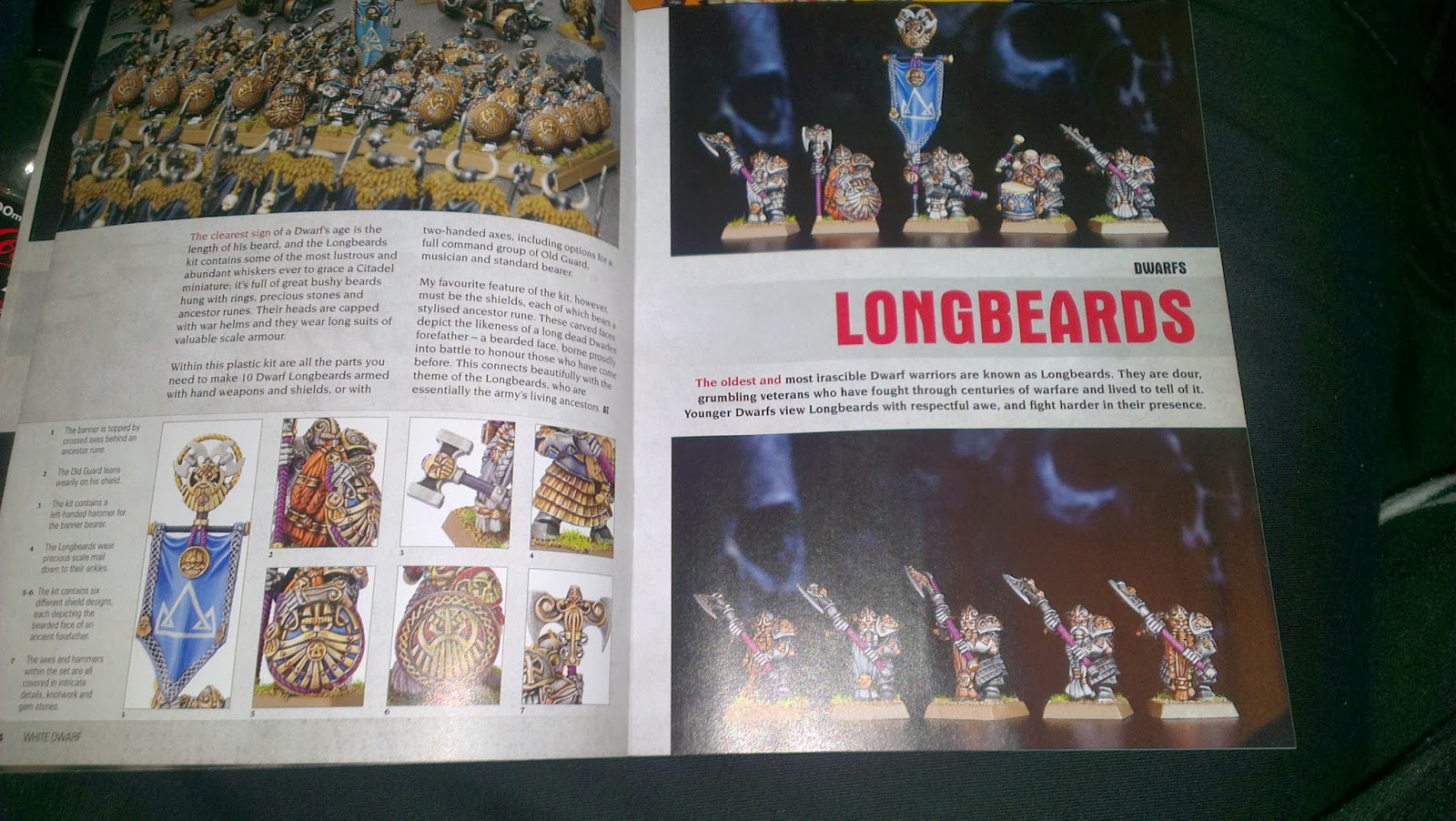
release, Tyranids for the first issue, the new Dwarfs for the second. Then the
hobby area takes a front seat as we get Paint Splatter (not really improved
from its monthly version) and Sprues and Glue which takes you through assembly
of (again) whatever is new. Now some might consider this the most banal of subjects,
teaching us to suck eggs, however I can say that even as a hobbyist of 20 years
or so there were a few suggestions in there that I hadn’t thought of! I can see
it running out of steam at some point but at the moment it is proving quite
useful.
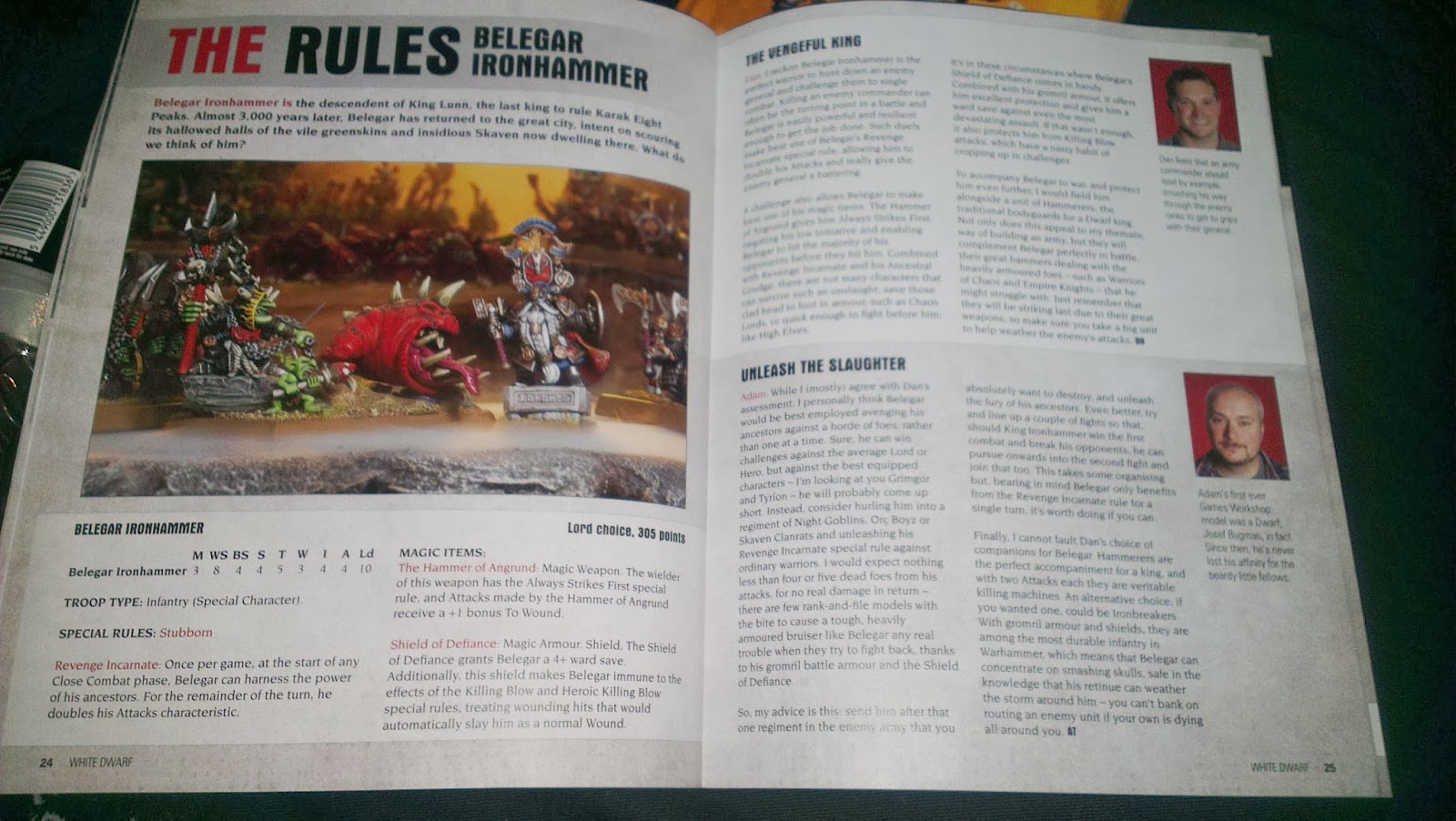
Next up RULES!! Yes rules are
back in White Dwarf! Now this actually seems a little odd as I cannot see them
being exclusive to the mag yet it seems somewhat redundant to have them be
copies of what is in the army book. It will be interesting to see how this
continues. Still for the moment yes, rules are back in White Dwarf and their
inclusion is most welcome. With a little useful tactical advice thrown in, this
is bonafide hobby content, the likes of which I thought was long gone from
White Dwarf’s pages.
 |
| OMG RULES!! |
Designer notes is next, I always
liked these, they were one of the sections I used to regularly read in the
monthly White Dwarf. It was interesting to see exactly why the designers (I
can’t say sculptors as nothing is sculpted anymore) made certain choices for
certain models. It also brought to the fore the designer’s obvious enthusiasm
for their projects as some trivial idiosyncrasy of design would be revealed
that only a true fan would appreciate. So I’m pleased to see this particular
segment continue.
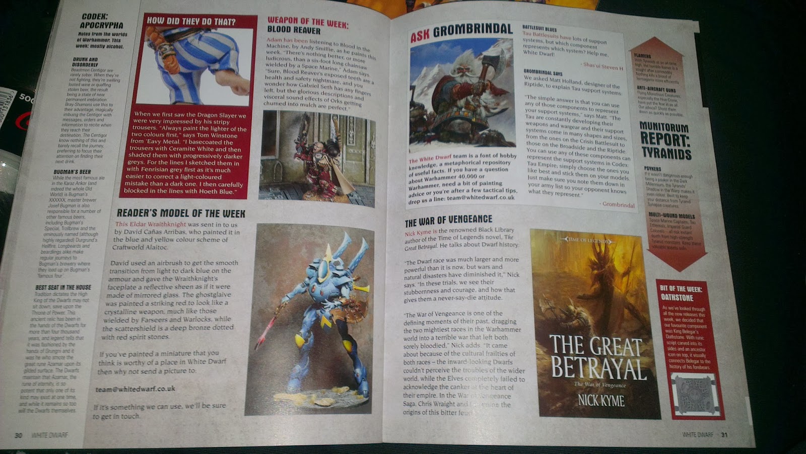
Bringing us to the last few
pages… This more than any other section is where the spirit of Grombrindal
endures. Entitled ‘This week in White Dwarf’, THIS is the one section that
reminds me of White Dwarf of old. With features like ‘Weapon of the week’ ‘Readers
Model of the Week’ even ‘Bit of the Week’ this is a treasure trove of sidebars
and boxouts. There’s lore, there’s trivia and tidbits and mini interviews, and
best of all ASK GROMBRINDAL!!! Yes a Q&A by the Great Bearded One himself!
I teleported straight back to 1996 reading this and it filled me with a strange
warm glow. Just a few paragraphs keeping Grombrindal alive and showing that
despite people’s fears this hallowed and revered character will continue and
not fade. It’s a real shame then that the digital edition of the magazine is
missing much of this wonderful content. In fact the E-Dwarf falls short in
general, having an inferior layout and less pictures too, somewhat baffling
given it costs more.
 |
| AWESOME! |
So overall WD Weekly was a
pleasant surprise, yes it is still far too heavily skewed with pictures, yes it
still has far too much white space and not enough text and yes the entire thing
is essentially still just an advert. BUT there is hidden depth and goodness to
be found within. There were times when I was reading this magazine that I had a
smile on my face and that has not happened reading White Dwarf for a long time.
It’s not quite a return to the White Dwarf of old but there are snippets here
and there that indicate a real desire to return to the days of quality hobby
content being featured within its pages. The spirit of Grombrindal is present
within, we should have known he would be far too stubborn to die without a
fight, he is a Dwarf after all!
Warhammer Visions on the other
hand doesn’t fare so well. More than anything else I would view this
publication as an anomaly. It’s early days, there hasn’t really been anything
like it before, but it is still an oddity. First off the format. It is
ironically smaller and yet thicker than a White Dwarf, making itself seem much
more like a catalogue (a comparison that doesn’t do it any favours). There is
also the matter of its layout. When GW heralded Warhammer Visions as a ‘High
Quality Visual Feast’ or something like that by which I read ‘picture book’ well,
I was right. There is VERY little text involved. More or less captions for the
photos and that’s about it. Of course those captions are in THREE languages..
 |
| Bizarre choice of layout and photos. Some of the cropping is terrible. |
That’s right, Warhammer Visions
is printed with English, French AND German text. I can only think that this is
a cost saving exercise and not some secret desire of GW to have all their
hobbyists trilingual, it’s a little jarring and I guess a little insulting and
further reinforces the feeling that this is some multi country catalogue. Still
some of the German translations for Tyranid weapons can be damn amusing to say
the least and reading some of the captions really WILL give you a little
understanding of the languages so bravo for that I guess.
 |
| Really does just look like a catalogue |
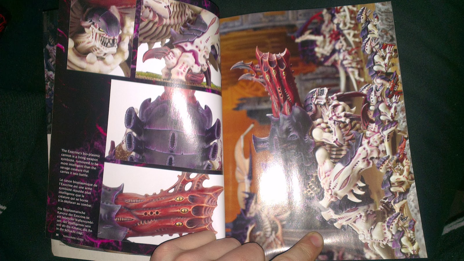
So on to content. Well, disappointingly the first 70 pages or
so are taken up with pictures of new releases. Picture after picture of (in
this instance) Tyranids, pictures of Tyranid armies, of individual models, of
battle scenes, you name it. You have the
funky pull out pages that were in the old monthly White Dwarf (and are so far
completely absent from the new weekly one) but there is no real sense to the
layout. Some images are bizarrely
cropped, you have double page pictures (which in a book with this format means
you lose the middle of the image) I could go on and on. It doesn’t help that
the vast majority of the Tyranids look the same which lends a certain amount of
repetition to proceedings. LOTR is also included (well the Hobbit) an odd
inclusion in a mag called WARHAMMER Visions.
After the deluge of Tyranid pics
it is Army of the month, a Vampire Counts army with some pretty cool ideas, (I
particularly liked the ghosts emerging from walls.) Then its fifty pages of
Golden Daemon entries, some of which are inexplicably blurry. Still there is some
fine content there and much of it is inspiring so it certainly serves its
purpose. The Ork Idol and Lahmean Queen
in particular stand out as worthy of mention.
 |
| As is this, fabulous conversion, but very little info |
Next up is one of the most
pointless things I have ever seen. A Battle Report without words, I’m not
kidding. You get the title, pictures of the forces, captioned pictures of the
game in progress (I assume) and then a picture of the victors, and that’s it!
No discussion of tactics or forces, no insight, no summary or commentary the
game. It beggars belief. On one hand it DOES seem like the natural conclusion
on to the way the battle reports have been evolving but nonetheless it seems
completely ridiculous. Considering the total lack of any kind of battlereport
in White Dwarf weekly does this mark the end of the written battle report? A
sad day indeed should that prove to be the case.
 |
| What the Fuck is this? |
Kitbash is next up and I sense
the potential of promise here, the Orks make a good subject for the first
edition and there are some wonderfully Orky contraptions on display, even the
captioned format lends itself fairly well to the ramshackle nature of the
conversions although more information would certainly be required should you
wish to replicate the procedure. Then its Blanchitsu, one of my favourite
sections of recent times as it reminds me that 40k can still be grimdark,
unlike lots of the new releases. Yes it is rubbing in our faces the fact that
there really should be an Inquis-skirmish 40k game but some of the models
featured are superb, and this month is no exception as Jakob Neilsen of Golden
Daemon fame shows off his stunning inquisitorial warband.
 |
| Again, with more words this would be worthwhile. |
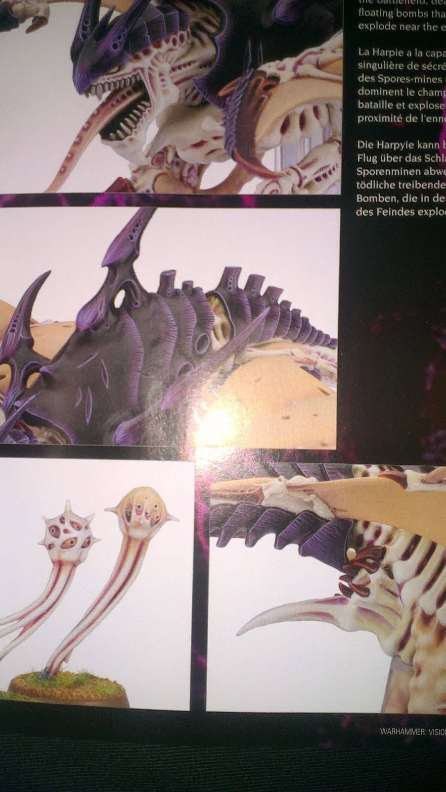
Inexplicably its more pictures of
Tyranids,next ostensibly to show off
more hive fleet colour schemes but it does just feel like a retread of the
FIRST 70 odd pages of the book. Still it does tie into the Paint Splatter
article which shows you how to replicate a great many hive fleet colour
schemes. Unfortunately it is again in the simplest way possible and feels
largely redundant being the same technique but with different colours over and
over. The obligatory store guide at the end takes us past the 220 page mark
though it sure feels cheeky have listings for worldwide stores in a mag that
does English, French and German, a small quibble I guess.
 |
| More oddly arranged pictures of bugs. Getting a bit boring now im afraid. |
So that’s Warhammer Visions and
in all honesty I found it rather lacklustre, the multi language thing looks
cheap, the layout of the pictures is lacking common sense, some are bizarrely
and poorly cropped and others are out of focus. A Battle report without the report
is the dumbest thing I have seen for a long time and although there are lots of
pretty pictures of finely painted models it is FAR too repetitive and the
captions just have the whole thing reading like a catalogue, it is obvious that
the entire thing has been put together as cheaply as possible. There is no
writing or creative effort apparent ANYWHERE within its pages. You could create
the same exact thing in no time with a google image search.
 |
| Same thing with different colours. A waste. |
BUT there is promise, with a
little work this could be a worthy publication. Let’s address a couple of
ideas: If you are going to stick to the ideas of captions make them worth
reading. Endless pictures the same as
you can see on the internet for free is pointless. To compound the issue many
of the photos appear to be of the same scene just rotated a little or lazily
cropped. There is also often little sense of composition. Of course this may
just reflect badly because the chosen subject is Tyranids, which let’s face it
are all painted more or less identically within a hive fleet, making affairs
rather monotonous. Hopefully it would be a different story with a force with a
little more variation. Still, what I would like to see would be highly detailed
shots of some of Citadels finest miniatures with multiple angles and close ups
of points of interest like a special painting technique or design point. Then
USE the captions to provide information on these, make it worthwhile reading
rather than a generic aside describing the scene with the very occasional
trivia or tidbit thrown in. Blanchitsu is great but again where is the insight?
A bit of input from the contributor or even John himself would certainly not go
amiss. Same with the army of the month, the Golden Daemon winners. Its all
short of INFORMATION. They say a picture tells a thousand words but that’s
really not the case. While we are on the subject let’s get some of those shots
in slightly sharper focus eh? The models and the paint job certainly deserve to
look their best.
So overall I have to say
Warhammer Visions is something of a disappointment. Not a complete write off by
any means but absolutely a missed opportunity. It would be easy to dismiss it
completely but let’s not forget that it is very much a brand new idea for GW
and may just need refinement. WD on the other hand has already had a year in
its new format to polish its content (and much of what is good about it is much
older!) So maybe Warhammer Visions will turn into something worthwhile given
time. We will just have to wait and see.
No comments:
Post a Comment